INTRODUCTION
Cancer Research UK funds scientists, doctors and nurses to help beat cancer sooner. They also provide cancer information to the public. They also raise money to fund the scientists to beat cancer sooner.
PURPOSE
The Cancer Research UK website does not have a selling process as the website’s purpose is to provide information on cancer, tell you about their research and to donate money to the charity. The donate page is kind of similar to a buying page; you enter the amount of money you want to donate, your reasons for the donation and then explain your donation. This process is quick and easy.

The whole website for Cancer Research UK is information on the topic and the pages are easy to understand as they are in a good and simple format. This is good because the topic of cancer can get very technical and confusing whereas, the way they have provided and displayed the information makes it much simpler to understand.

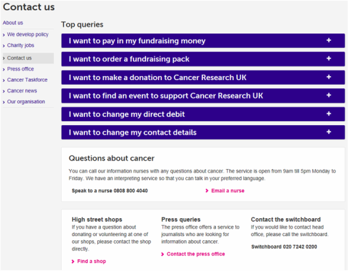
The contact page on the Cancer Research UK page is very useful. They have the top queries at the top of the page so there is quick and simple access as they are most frequently visited. They then have a contact number to talk directly to a nurse about any questions or concerns about cancer. The page then goes onto contact numbers for shops, press queries, switchboard to contact the main office and then for general questions and comments there are three contact options; online, phone or post.

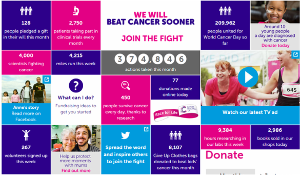
On the Cancer Research UK website they advertise what they have achieved as an organisation; facts and figures are clearly stated on their homepage when you first access the website. These facts and figures are laid out in a very eye-catching format and are very colourful; this is a great example of good advertisement because it grabs the reader’s attention.
As far as I am aware, the Cancer Research UK website does not have any newsletter campaigns however, there are plenty of ways to get in contact with them.
FEATURES
Navigation around the Cancer Research UK website is very simple. The menu bar is easy to understand because the layout is very smart; the website has been separated into five different sections: About Cancer, Support Us, Where Your Money Goes, Fundraising For Researchers and About Us.


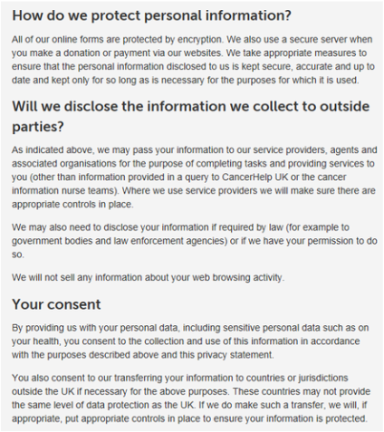
This makes the website very efficient and makes the search speed much quicker as you can access where you want to go on the website fast. There is a whole page dedicated to the privacy of information on the Cancer Research UK website. They explain how they use a secure server to protect payments. They also say that they take appropriate measures to secure personal information and they only keep information for as long as necessary. They also talk about your consent; they mention that if you discuss personal information then you are allowing Cancer Research UK to collect your information and may transfer the information to other countries and jurisdictions. It’s good that there is this page on the Cancer Research UK website because people visiting the website and discussing there personal information with the organisation want to be reassured that their details will be secure and not exposed to any unnecessary people.
The language is very appropriate for the readers; the language can get very complex when talking about cancer as there can often be medical terms that members of the general public will not understand. The Cancer Research UK website have made it clear that they have used simple language to make the information easier to understand for the people who visit the website. As the organisation is UK based, English is the only language available to read in. The Cancer Research UK website has a page dedicated to the accessibility of their website. Here they explain how they want everyone to be able to access their website whether they have little computer knowledge or disabilities. Then there are three categories; help with seeing the page – here they explain how you can increase the font size, change the colour and magnify the website to see clearer. Help with your keyboard and mouse – here they explain how to use these devices and give links to further help. Other help available – here they give a link to any further help if needed.

VISUAL APPEAL
Purple, pink and light blue are the main colours for the Cancer Research UK organisation and these colours are used on their website so it is very easy to identify what organisation the website is for. The fonts used on the website are easy to read and simple to understand, this is good because they will have people of all abilities accessing the website. The graphics on the website are in high definition and are very colourful; they are visually appealing. The videos on the website are played through YouTube and are very easy to access and watch. You can change the size of the video and the volume all at the click of a button. The image is clear to watch and isn’t fuzzy or pixelated at all.

The transitions between pages are fast and don’t slow down the website at all. The menu bar uses transitions when hovering over a tab and these are also very simple effects and in my opinion make the website better. There is a unified style throughout the Cancer Research UK website, the font is consistent and so are the colours. There is a bit of white space on the website however, I think this is part of their theme. It is used as a background and works well; it does not make the website look boring or unappealing.
The branding is consistent throughout the Cancer Research UK website as their colours are used on every page, this allows the visitors of the website to know they are on the right website. The website fits well with their target audience because the language is easy to understand, the font and graphics are simple to see and it is easy to navigate around the website. The target audience for the Cancer Research UK website is everyone, cancer effects everyone therefore they visit the website. This is whether they are a fighter, knows someone who is a fighter, they are a survivor, know someone who is a survivor or they just imply want to know more about cancer.
The branding is consistent throughout the Cancer Research UK website as their colours are used on every page, this allows the visitors of the website to know they are on the right website. The website fits well with their target audience because the language is easy to understand, the font and graphics are simple to see and it is easy to navigate around the website. The target audience for the Cancer Research UK website is everyone, cancer effects everyone therefore they visit the website. This is whether they are a fighter, knows someone who is a fighter, they are a survivor, know someone who is a survivor or they just imply want to know more about cancer.
