INTRODUCTION
| The National Health Service is funded health care system in the countries of the United Kingdom are referred to as the National Health Service (NHS). The systems are primarily funded through central taxation. | 
|
PURPOSE
The NHS website does not sell any products because it is a not-for-profit company and their website is there to inform the public on illness and their symptoms. The website is easy to understand and is fairly simple to navigate yourself around the website, this is necessary for the NHS website as they will have people of all ages and abilities visiting their website so it needs to be easy to understand. As the NHS website doesn't have a selling process their customer service options are much more based on getting in contact and contributing a complaint.

The advertisement on the NHS website is very clear and effective. It is big and hard to miss; this is vital for advertisement because it is there to be seen!

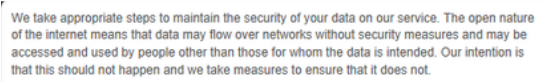
NHS’s target audience is huge as they provide services to people of all ages and abilities. I feel that they focus greatly adults because you wouldn’t get a six year old looking up their symptoms on the NHS website, it would be their parents who would look for them therefore I feel the language they use is very appropriate. The language is easy to understand and there aren't too many technical medical words that the general public may not understand, they go into more detail and simplify the meanings. NHS is a website frequently used to find out your symptoms if you are feeling unwell so the privacy and confidentiality of your details are vital as some people do not want others knowing what’s wrong with them.

The NHS website gives the options for you to sign up for newsletters for more information on the following areas: Dementia, Pregnancy and Baby, Weight Loss. These newsletters are optional and are monthly e-newsletter packed with the latest news.

FEATURES
The NHS website has a very simple layout, the menu bar is easy to understand and if you are struggling to find what you want through the menu tab you can go to the search bar to find specifically what you are looking for.

NHS’s target audience is huge as they provide services to people of all ages and abilities. I feel that they focus greatly adults because you wouldn’t get a six year old looking up their symptoms on the NHS website, it would be their parents who would look for them therefore I feel the language they use is very appropriate. The language is easy to understand and there aren’t too many technical medical words that the general public may not understand, they go into more detail and simplify the meanings. NHS is a website frequently used to find out your symptoms if you are feeling unwell so the privacy and confidentiality of your details are vital as some people do not want others knowing what’s wrong with them.
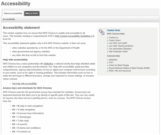
The search speed on the NHS website is good, you aren’t left waiting for ages on trying to find your symptoms, someone else’s symptoms or just reading up about some illnesses or diseases. This is good because you don’t want to be waiting to find out what may be wrong with you or someone you know. The NHS website has an accessibility page and is covered by the Web Content Accessibility Guidelines 2.0, level AA. This is expected as they are a health care website.
The search speed on the NHS website is good, you aren’t left waiting for ages on trying to find your symptoms, someone else’s symptoms or just reading up about some illnesses or diseases. This is good because you don’t want to be waiting to find out what may be wrong with you or someone you know. The NHS website has an accessibility page and is covered by the Web Content Accessibility Guidelines 2.0, level AA. This is expected as they are a health care website.
VISUAL APPEAL
The NHS website is mainly white, with some blue and a bit of orange. I feel this fits the purpose of the website as the website is there purely to provide information not to advertise, catch your eye or anything along those lines therefore big and bold colours are not necessary. The font is clear and simple to read, this is good because there will be people of all abilities accessing the website so it is important that the text is easy to read. The images on the NHS website are easy to see and clear to understand. The videos are also easy to watch, listen to and accessibility is simple; just one click of the play button and you watch the video.

Transitions on the NHS website are quick and simple; they aren’t off putting or too complex. The text and colours are a consistent theme throughout the website which is good because it links the pages up all through the website; the theme is consistent.
There is a fair amount of white space on the NHS website however; I do not think this is a bad thing. The National Health Service is about health care therefore doctors and hospitals come to mind and I think the website links well with its purpose. The website feels quote clinical and I think this is clever as the website is there to provide medical advice
The website is almost clinical like and this is good because it is targeting the audience with what they are there to know; medical advice. The company colours are also consistent throughout the website; blue, white and orange.
